A New and Refreshed Brand for LG Marketing
We are proud to unveil a refreshed brand identity and logo for LG Marketing. Introducing LG Marketing+ or LG+!

LG Marketing+ | February 14, 2023
A New and Refreshed Brand for LG Marketing
We are proud to unveil a refreshed brand identity and logo for LG Marketing. Introducing LG Marketing+ or LG+!
LG Marketing+ | February 14, 2023
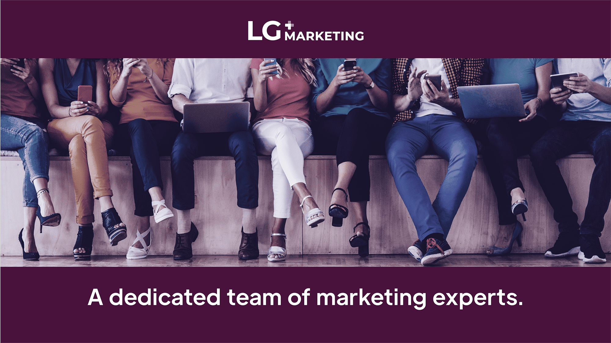
As we kick off 2023, we are proud to unveil a refreshed brand identity and logo for LG Marketing. Introducing LG Marketing+ ( or LG+). In recent years, our team and capabilities have grown, and so it’s no surprise that the theme of our refresh is the concept of “more.” Today, our clients benefit from more knowledge, talent, and support than ever before. Every day, we have the privilege of collaborating with passionate companies to generate core marketing deliverables, creative strategy, public relations and thought leadership initiatives, and practically everything in between.
As we kick off 2023, we are proud to unveil a refreshed brand identity and logo for LG Marketing. Introducing LG Marketing+ ( or LG+). In recent years, our team and capabilities have grown, and so it’s no surprise that the theme of our refresh is the concept of “more.” Today, our clients benefit from more knowledge, talent, and support than ever before. Every day, we have the privilege of collaborating with passionate companies to generate core marketing deliverables, creative strategy, public relations and thought leadership initiatives, and practically everything in between.
Here is a quick rundown of the meaning behind our updated logo, colors, and brand identity in general, all of which play a crucial role in defining who we are – and what we stand for – as we navigate an exciting future.
An Identity That Means “More”
The new LG+ logo leaves behind our previous, minty heavy color palette in favor of something a little more bold and fun. By embracing a wine berry palette coupled with a vivid secondary color – we’re doing our part to stand out and disrupt while projecting a sense of depth, complexity, confidence and success.

 An equally crucial part of our new identity is the “plus” sign, featured prominently in our new logo. For us, the plus sign neatly represents the concept of “more:” more expertise, more team members, more skills, and more success. The + sign is composed of two brand color shades: a light shade and a dark shade. This represents the idea that we are at our best when we work and live at the intersection of diverse perspectives, experiences, and skill sets.
 Often, our clients tell us that we function as an extension of their team, and our own team taps professionals with unique and varied backgrounds. By putting the right people and skills together at the right time, we create real and lasting value for our clients.
At the end of the day, “more” is who we are at our core, and we believe our new visual identity captures our essence beautifully.
These are exciting times at LG+, and we’d love to hear what our clients, partners, and colleagues think about our refresh. Reach out to us directly at lynh@lgmarketing.me, and here’s to continued success in 2023 and beyond.
Here is a quick rundown of the meaning behind our updated logo, colors, and brand identity in general, all of which play a crucial role in defining who we are – and what we stand for – as we navigate an exciting future.
An Identity That Means “More”
The new LG+ logo leaves behind our previous, minty heavy color palette in favor of something a little more bold and fun. By embracing a wine berry palette coupled with a vivid secondary color – we’re doing our part to stand out and disrupt while projecting a sense of depth, complexity, confidence and success.
An equally crucial part of our new identity is the “plus” sign, featured prominently in our new logo. For us, the plus sign neatly represents the concept of “more:” more expertise, more team members, more skills, and more success. The + sign is composed of two brand color shades: a light shade and a dark shade. This represents the idea that we are at our best when we work and live at the intersection of diverse perspectives, experiences, and skill sets.

Often, our clients tell us that we function as an extension of their team, and our own team taps professionals with unique and varied backgrounds. By putting the right people and skills together at the right time, we create real and lasting value for our clients.
At the end of the day, “more” is who we are at our core, and we believe our new visual identity captures our essence beautifully.
These are exciting times at LG+, and we’d love to hear what our clients, partners, and colleagues think about our refresh. Reach out to us directly at lynh@lgmarketing.me, and here’s to continued success in 2023 and beyond.